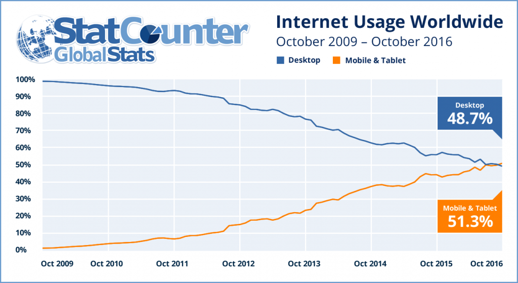
Mobile and tablet usage across the StatCounter network has exceed desktop usage for the first time in October. We issued a release about this on our Global Stats site this morning.
It has never been more important to check and make sure your website is mobile friendly. Google released a tool to do that here.
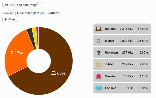
To see the breakdown of desktop vs mobile and tablet usage for your own website simply click “Browsers” and then “Platforms” from the left stats menu. Here is an example of how it looks:


They also shared good up to date Entertainment News magazine..
RIP Desktop
Unknown hits coming from space ? Mobile coming like a star for hit.
Mobile hits increasing beacuse new phones and tablets let you make everything with it.
This graph shows us to responsive design and Accelerated Mobile Pages Project Amp is so important for future.
Great idea to change focus to mobile versions.
It’s a whole new world with such variety in devices. I made sure my blog theme works and formats for both mobile and computer.
we freshly improved all of our website templates to responsive for that reason mobile phone visitors can browse site very quickly.
I am amazed at the growth of mobile browsing today. The sheer number of web traffic now is thanks to mobile browsing, people on trains for example everyone in nearly every country has a mobile now the number of web sales is now so much higher then shopping at stores. These features are well overdue and fantastic!
i apriciate to u nice blog you write
This is why we must do responsive website design, absolutly!
Türkiye’nin Hd Kalitesi ile sunulan en hit ve en güncel filmlerin kaynagı olan altyazılıfilm.com 720p ve 1080p ile kullanıcılarına gururlar sunar..
Türkiye’nin Online Hd Film Sitesi Filmleri Hergün Güncel OLARAK 720P VE 1080p Hd Kalitesi İle Siz İzleyicilerimize Sunuyoruz
İyi Seyirler.
http:www.filminetizle.com
It just going to be mobile all the way. Tablets are too big to carry around. Love the article!
awesome…. thank you very much
I have lot of websites and the results shows an impressive increase in mobile visitors which is logical. Mobiles and tablets are used more and it became a part of our life (including searching any information).
Thanks for the infographic.
Thank You.
Thanks for the infographic. Even my ecommerce site and personal blog are showing steady increase in mobile and tablet visitors than the desktop visitors. Compared to 2015 my sites saw 30% increase in mobile visitors. I’ve recently changed my website templates to responsive and thus mobile visitors can easily browse the site. For coding though I still use my personal desktop and office laptop as its simpler on big-screen with keyboard and a mouse. The Internet may see mobile visitors rise up to 60-65% in 2017?
Good – I should certainly pronounce, impressed with your web
site. I had no trouble navigating through all tabs and related information ended up
being truly easy to do to access. I recently found what I hoped for
before you know it at all. Quite unusual. Is likely to appreciate it for those who add forums or anything,
web site theme . a tones way for your client to communicate.
Nice task.
The use of smartphones and tablets have been an issue that everyone should pay attention to. The Handheld Traffic is getting bigger … that’s a good thing, and we need to pay close attention today. I’m happy to say that I was able to adapt and make my site mobile-friendly