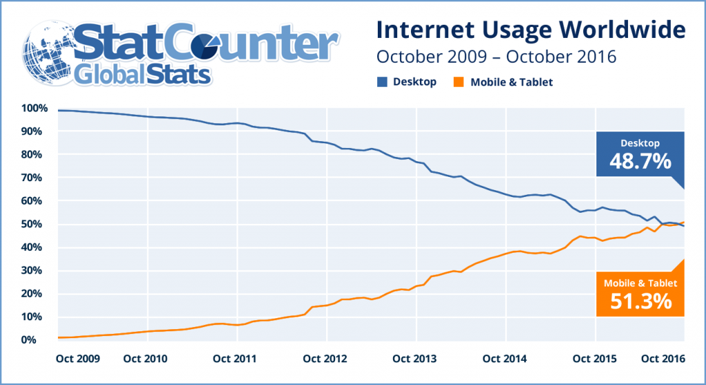
Mobile and tablet usage across the StatCounter network has exceed desktop usage for the first time in October. We issued a release about this on our Global Stats site this morning.
It has never been more important to check and make sure your website is mobile friendly. Google released a tool to do that here.
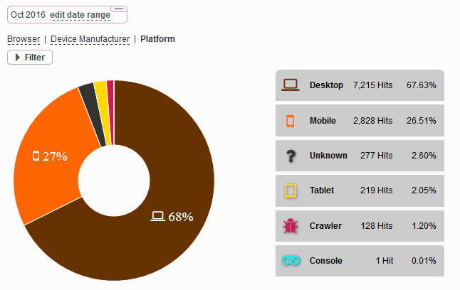
To see the breakdown of desktop vs mobile and tablet usage for your own website simply click “Browsers” and then “Platforms” from the left stats menu. Here is an example of how it looks:


great post. Thanks for share
Good
Glad to know this info.
Buen arcticulo. Saludos desde http://limpiezasava.com
I also find it amazing how so few websites today are mobile friendly. How can it be that so many websites are not mobile friendly considering the sheer number of mobile browsers that is growing so fast as people browse on their phones all over the world. It baffles me that so many webmasters do not make their websites mobile friendly
Nice post. good comments
Thank you
love this article, it is very useful to choose a new theme for my web. Thank you
It is very entertaining to read this article.
It is very entertaining to read this article. Congratulations to the writer.
Mostly users use their tablets and smartphones for casual browsing and also use it for research purpose. While how long you stay with desktop pc will be the only time of using that but sometimes people use both ways at the same time. It also depends on the age category of visitors coming on your site.
In addition, when a guy subscribe a mobile data (Remember: mobile carriers focus on giving more subscription offers) then obviously he will be using it to browse your website. So we can say Tablets and Smartphones gonna get an average of 3/5 of total traffic soon, possibly in current year.
The traffic also depends on the niche of an individual website. But what are the differentiable niches in that case other than Tech?
I what you using mobile four.
I was so happy because I have been using the mobile side for more than a year
Awesome Tool!
I also find it amazing how so few websites today are mobile friendly. How can it be that so many websites are not mobile friendly considering the sheer number of mobile browsers that is growing so fast as people browse on their phones all over the world. It baffles me that so many webmasters do not make their websites mobile friendly
hızlı ve öfkeli filminin güncel hd filmlerini sitemizden izleyebilirsiniz.
kaynak: http://www.xn--altyazlfilm-4zbb.com/hizli-ve-ofkeli-8-altyazili-izle.html
I am surprised that by now stats for mobile use is not much larger. It seems everyone i know today reads the web on their mobile devices. I am sure in 2 years it will vastly outnumber desktop browsers.
Mobile is the way it is now for everyone. The huge growth is thanks to third world countries getting online such as africa and asia. This has exploded all over south america too as mobiles are cheaper then pcs used to be making accesable for billions of new users
It’s sad when you see that it’s almost the end of 2016 and there are still a lot of websites that aren’t responsive.
I personally think that the desktop/laptop will never die. I find myself frustrated with the compacity of what I can do on a mobile/tablet compared to desktop/laptop. Keep in mind, I am 35 and grew up with computers and video games, so its not as if I am a relic.
Something about small screens and limited UI on mobile will always keep laptops and desktops relevant in my opinion, something comfortable about the bigger screen.
Mobile is the future 🙂
Desktop won’t die but also people won’t surf on their desktop or laptop when are traveling, relaxing in park, driving (oops). They will use their smartphones.