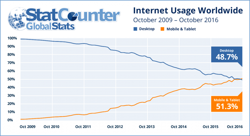
Mobile and tablet usage across the StatCounter network has exceed desktop usage for the first time in October. We issued a release about this on our Global Stats site this morning.
It has never been more important to check and make sure your website is mobile friendly. Google released a tool to do that here.
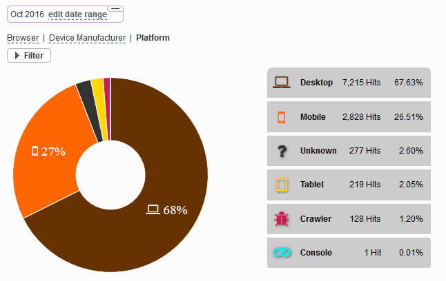
To see the breakdown of desktop vs mobile and tablet usage for your own website simply click “Browsers” and then “Platforms” from the left stats menu. Here is an example of how it looks:


This is a good article in all aspects for mobile and tablet users.
Thank you for this important information, Great blog
hi admin blog is greed
thanks for post.
Very interesting 🙂 !!!
great post
great 🙂
Thank you im using statcounter for all my websites.
Thank you statcounter great post.
great post thank you
thanks for sharing
Thank You
great article.
great post. thanksss
good article. Congratulations to the author.
great post. thanks for sharing
I just found this blog and have high hopes for it to continue. Keep up the great work, its hard to find good ones. I have added to my favorites. Thank You.
Thank you for this important information, looking forward
Thank you very much for this useful info!
woow it´s good